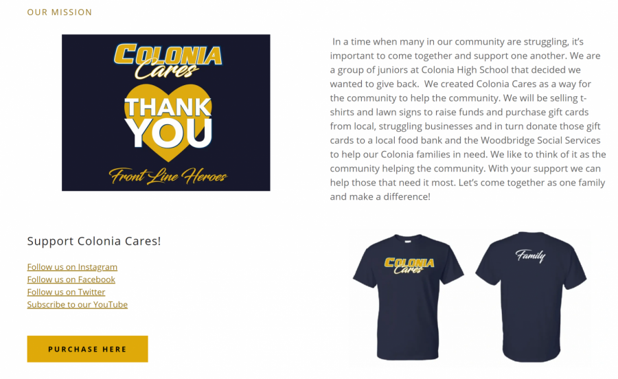
Recently, I was tasked with creating a website for a charity group, Colonia Cares, that 10 of my classmates and I created to help those effected by Covid -19 in town.
Colonia Cares was created by students in Colonia’s junior class to raise money to provide gift cards from struggling businesses to give to those members of the community suffering the tragic effects of Covid-19. According to Mayor John McCormac’s weekly announcement, as of May 6 Woodbridge Township has lost 1,405 residence to the virus. Many have also lost their jobs making it hard to provide for their families.
I consider myself a pretty tech-savvy guy. Therefore, I believed that it would be no problem at all for me to make a website. I turned on my laptop, logged onto the website builder, and I was completely shocked. The amount of tools and options available to me was overwhelming. I didn’t know what anything did or how to use certain features. It even took me a while to find out how to add text! I was utterly lost.
Learning the ropes
The first couple of hours were absolutely awful. It took me so long to do anything, and I was getting frustrated easily. It took me awhile to figure out how everything worked. However, after the painstaking process of learning my way around the website, I started to get the ball rolling. I started out with writing the paragraphs. After that I decided to add several pictures to the page. Following the pictures I added interviews, finishing up the full layout of the page. When I finished adding all of the information and media to the website, I realized that there was still so much more that I could add to the website. By adding more to the website besides just basics, I could try and get more people interested in the charity group. This was when I really started to have fun!
Getting going
At this point I had pretty much learned how most of the tools available to me worked, and I used them to make the website look great. I used color finders and hex-codes so that the website would have a consistent theme. After that, I used photoshop to change up our logo so that it looked like a banner going across the top. Then I added action buttons that took you to our social media pages when you clicked on them.
It took me a while to learn how to use and implement all of the features available to me when making this website. However once I figured everything out, I had a lot of fun making it. The end product was simple and colorful, and did everything I needed it to. I was very proud of my work and how I was determined throughout the whole process.
The website I designed, coloniacares.com, made it easy for people in our town to learn about the Colonia Cares charity and support our cause. A member of Colonia even asked me if I wanted to tweak their website after seeing my work.
The process of creating this website was at some points frustrating and intimidating, but as I learned more about what I was doing it became fun and enjoyable. The process of creating a website was like anything else in life: the more you do something, the better you get at it. Maybe in the future I can help more people make their websites more appealing and more efficient.


